Work that's changing how
we view the world.

Explore Our Impact
We’re proud to partner with some of the most iconic brands on the planet.
We’re even prouder to help produce results that are reshaping lives and communities.
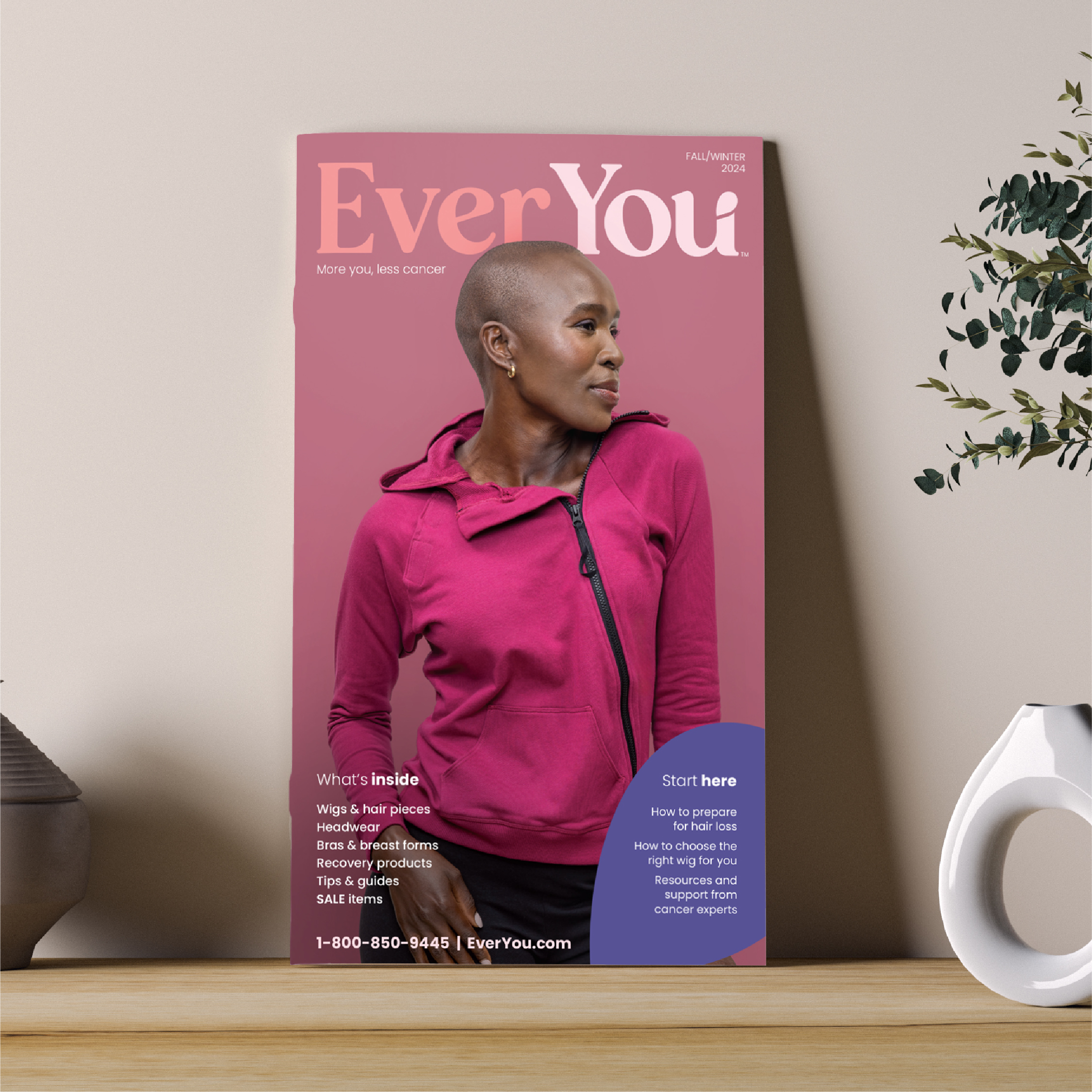
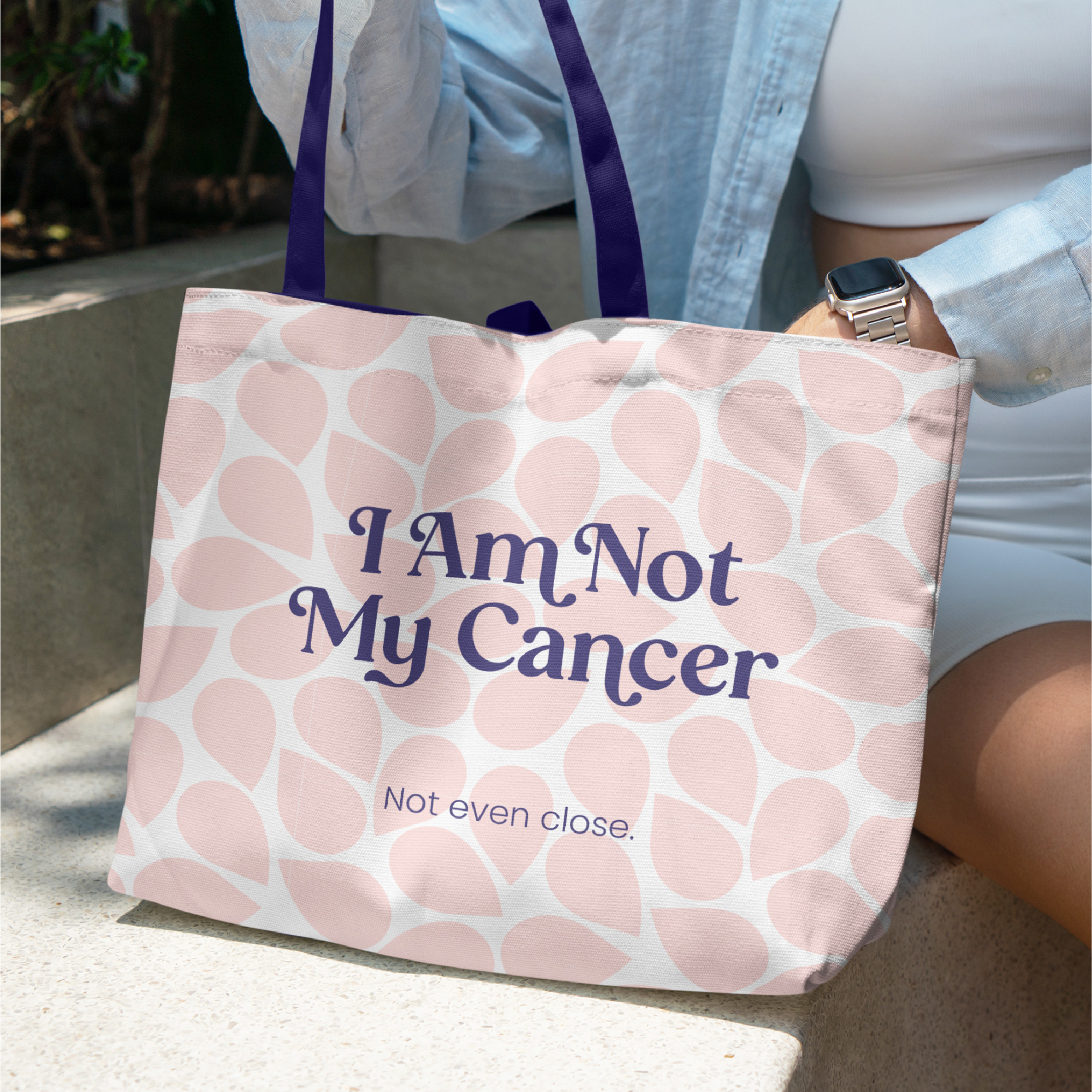
Helping People with Cancer Look & Feel Like Themselves
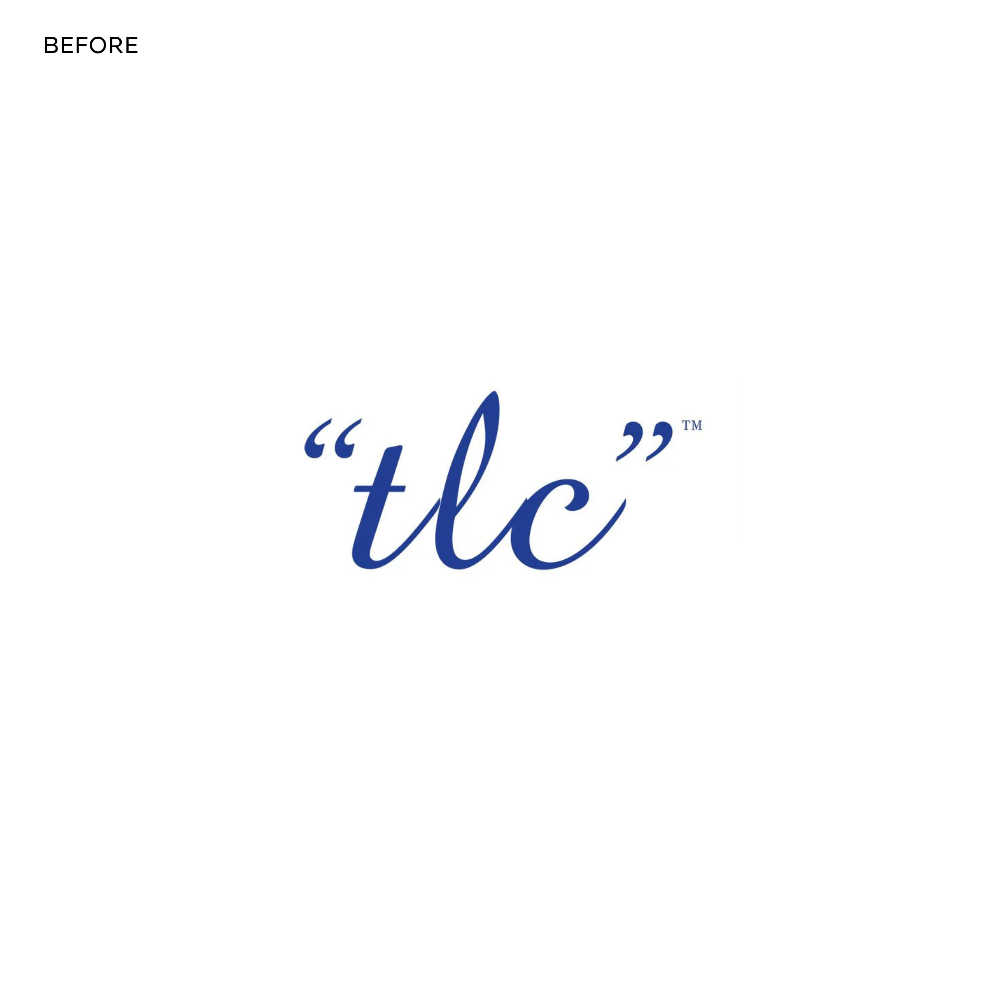
Since 2005, the American Cancer Society has provided wigs, headwear, bras and related products to help people going through cancer treatment through its “tlc” Tender Loving Care program. With a generic name that didn’t embody the purpose of the program and with increasing competition in this e-commerce space, the American Cancer Society turned to Round Square to refresh the program for increased impact.
We conducted extensive research, including one-on-one interviews with people who had undergone chemo, radiation and/or a mastectomy for cancer during the past three years. Three important insights emerged:
- Looking in the mirror is hard for many going through treatment. Interviewees didn’t just want to look and feel good, they wanted to look and feel like themselves. They expressed the desire to “feel normal.”
- The shopping process during cancer treatment is extremely overwhelming. Interviewees want to bring calm to this chaotic time. They also care most about comfort and quality.
- Few associate the American Cancer Society with a retail shop or having the variety, quality or convenience of traditional retailers. Positioning must lead as an e-commerce retailer over a nonprofit program.
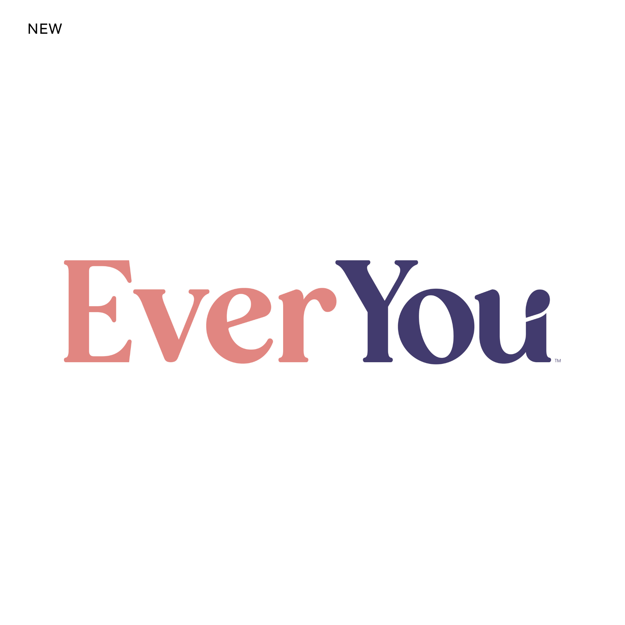
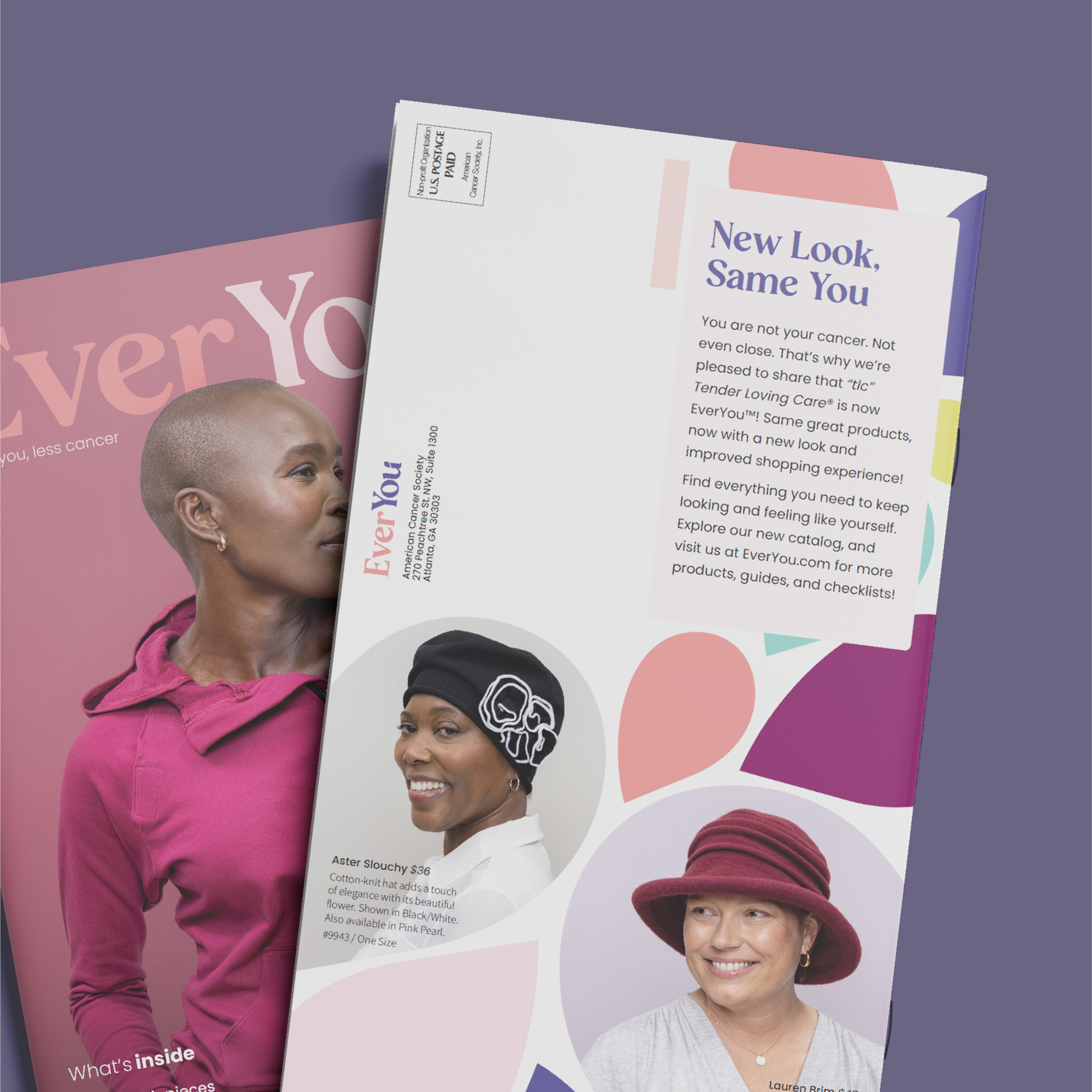
Based on research findings, we created the name EverYou to replace “tlc.” It directly addresses that no matter what you experience or go through, you’re always you — and deserve to look and feel like it.
The new logo features the Orange Squash typeface with custom rounded edges to convey desired softness. The lowercase e stands tall and proud to reflect confidence and optimism. Because audiences want to see themselves when they look in the mirror, the petal at the top of the u was developed from a mirror image of the whitespace in the e.
The u design was inspired by the Japanese art of Kintsugi that repairs broken pottery using a gold lacquer. Rather than hiding cracks and imperfections, the art accentuates breakages. Like cancer, one’s experience and scars make them stronger and more beautiful. Finally, the breakage in the u, which creates a petal shape, suggests continued evolvement and growth. Cancer is just a piece of you — you are and always will be so much more than cancer.
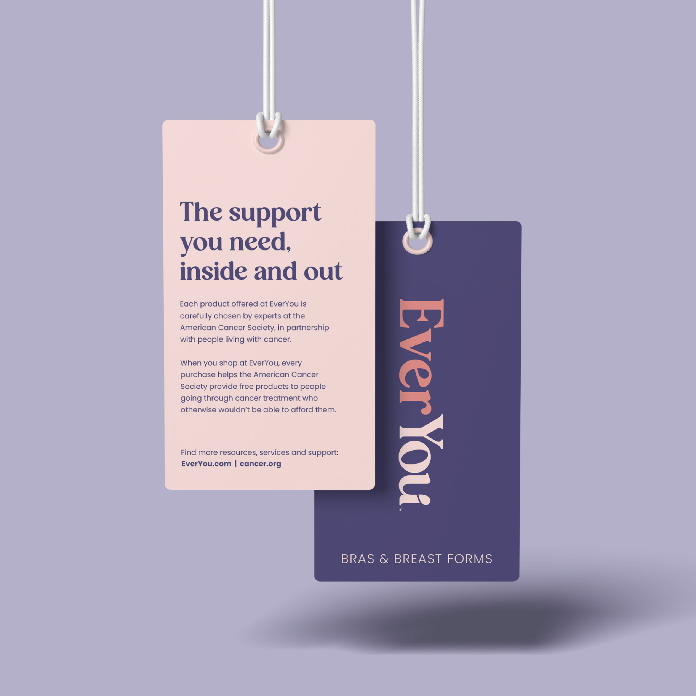
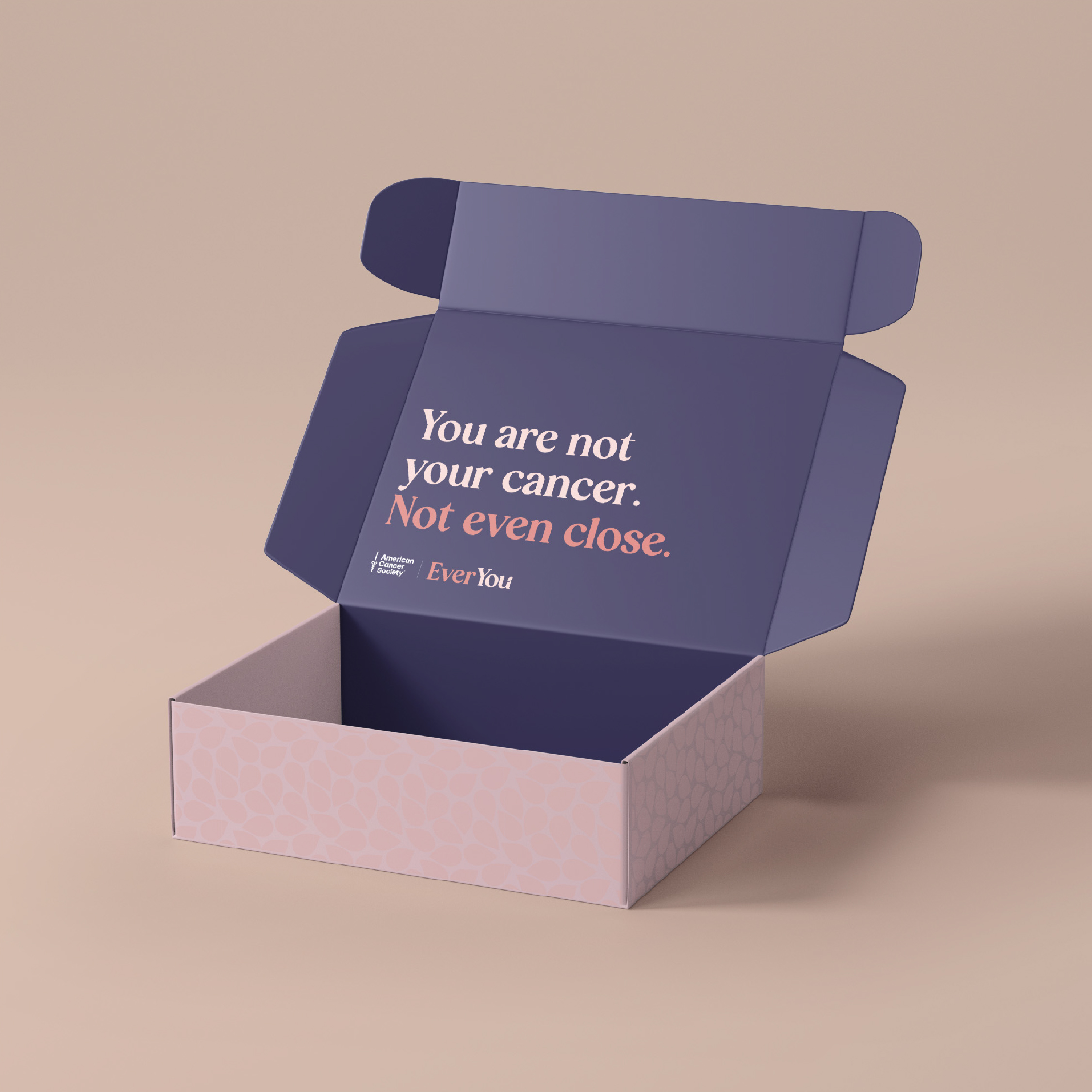
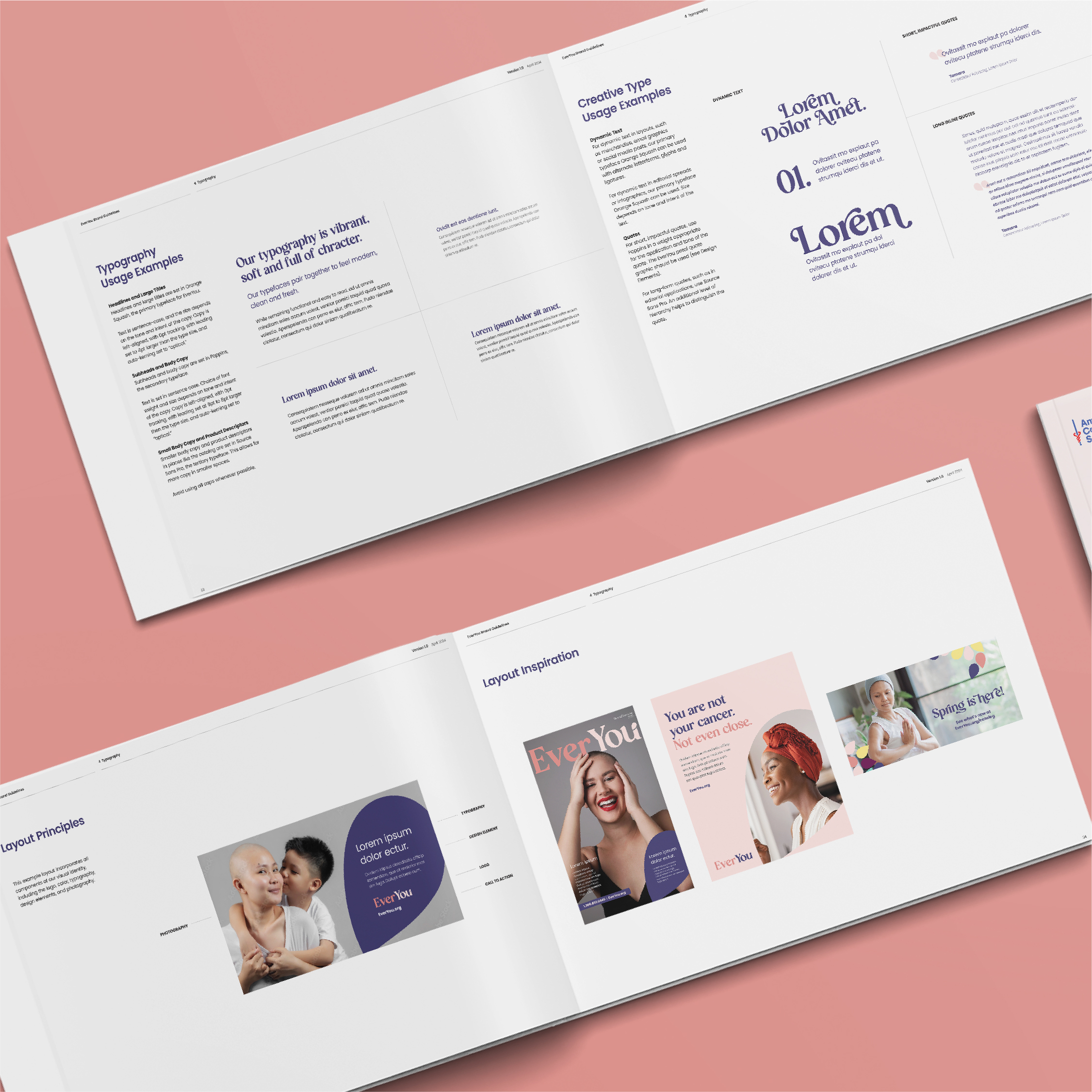
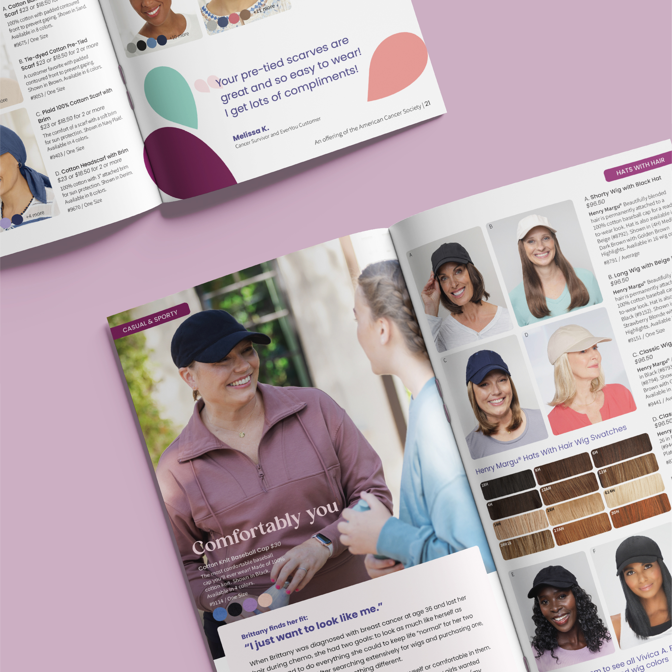
In addition to the new name, logo, and brand identity guidelines, Round Square also revamped the product catalog and front-end website design.
The brand officially launched in August 2024, and we will continue to track results. Upon releasing the new brand internally, one staff member shared the following: “I am so very proud to work for the American Cancer Society every day, but some days the pride spills over into tears. EverYou has brought the tears of pride and joy for this organization.”

Cultivating Kinder Kids
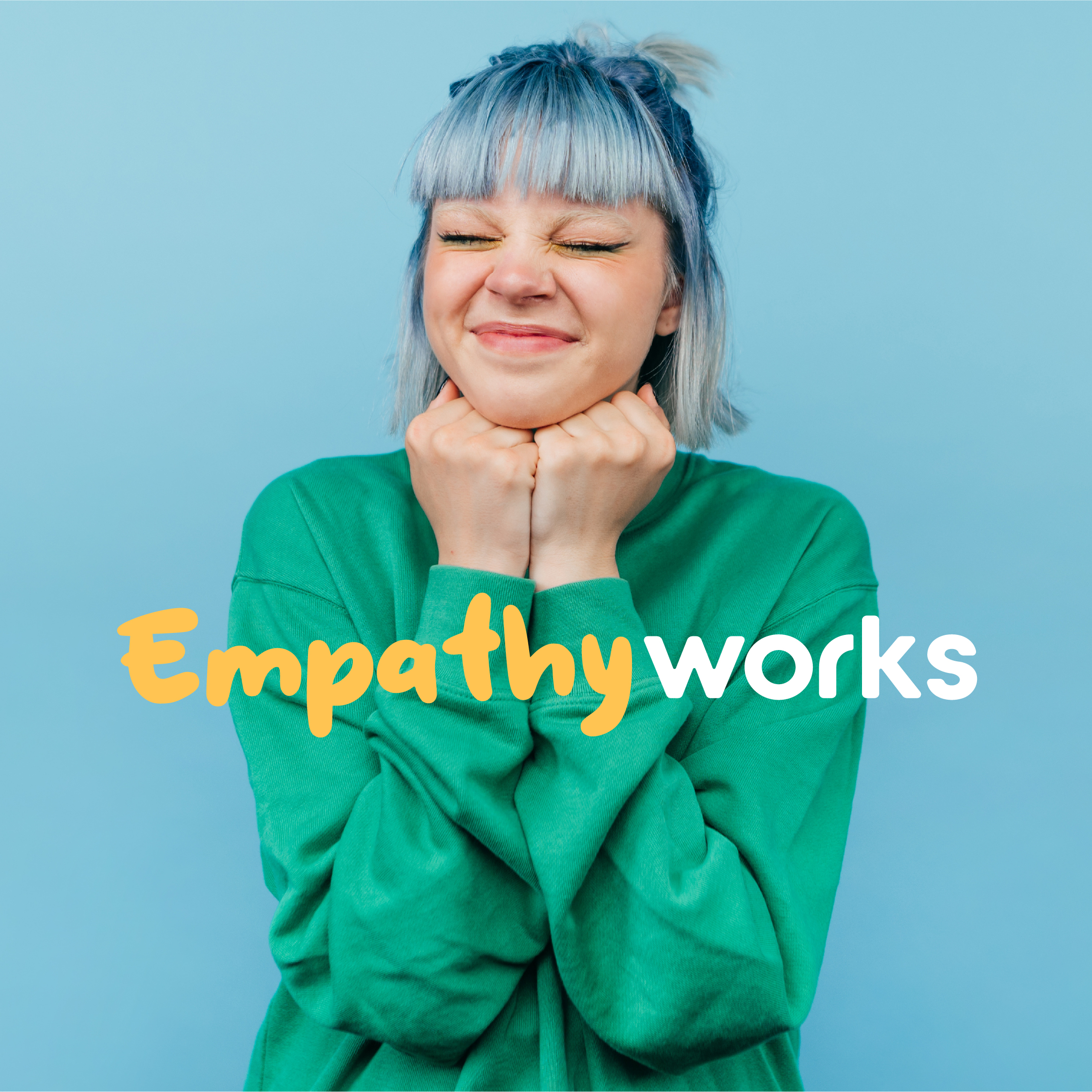
Frameworks of Tampa Bay is a nonprofit organization that focuses on helping children learn to understand, navigate and manage their emotions. Although countless research studies show that children who develop emotional intelligence (EQ) skills become more successful personally, academically and professionally, staff and volunteers struggled to communicate the organization’s mission and relevance consistently. Furthermore, the concept of emotional intelligence wasn’t always understood or viewed as urgent.
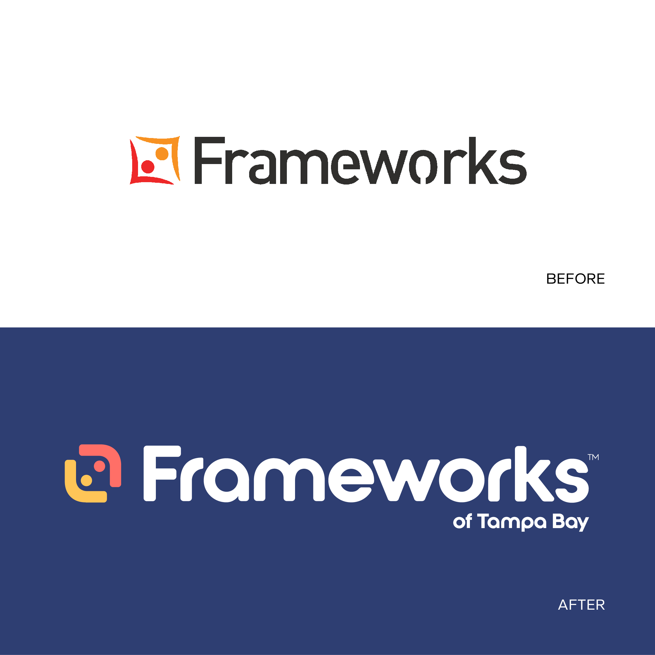
While Frameworks focuses on youth and their emotions, messaging led with academic, functional language, while its brand identity featured sharp edges and mechanical typography, both lacking emotional resonance and the human connection it exists to support.
After conducting extensive research, Round Square developed a new brand strategy and revitalized messaging for Frameworks. This included “rebranding” emotional intelligence itself, with a more lay-friendly and compelling definition to drive understanding and urgency.
Next, we revitalized Frameworks’ identity to visually convey its purpose, including a new logo, tagline and visual identity system.
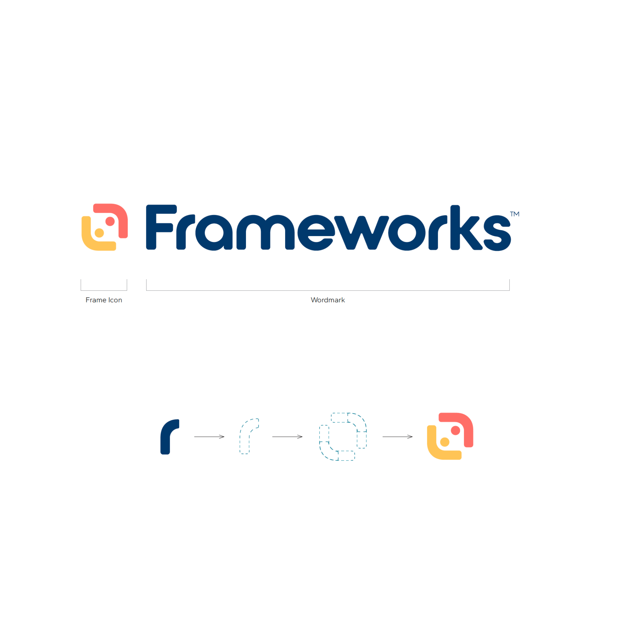
To represent the solid foundation of emotional intelligence that Frameworks aims to build, the logo’s wordmark features letterforms constructed from simple, uniform shapes, with custom rounded corners that evoke warmth and a youthful spirit.
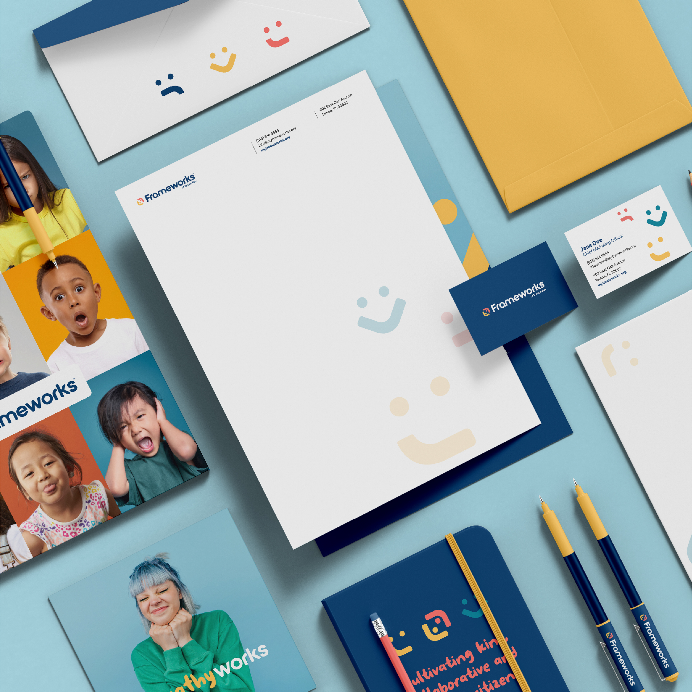
We created the frame icon using the ‘r’ in the wordmark to represent two people coming together, a visual representation of the mission. Similarly, we used pieces of the wordmark and dots from the icon to create a custom set of emotion graphics to visually associate Frameworks with emotions.
Frameworks is currently in the process of rolling out its new brand, including refreshing its website to match its new identity. They’ve asked Round Square to help them with some priority implementation materials.
Here’s what their CEO had to say about the partnership:
“We absolutely loved working with the Round Square team! They really took the time to get to know us and what we were aiming for, and the results were better than we ever imagined. Thanks to their hard work, our brand looks amazing, and we’ve gotten so much great feedback. We can’t wait for the next phase of our partnership!”
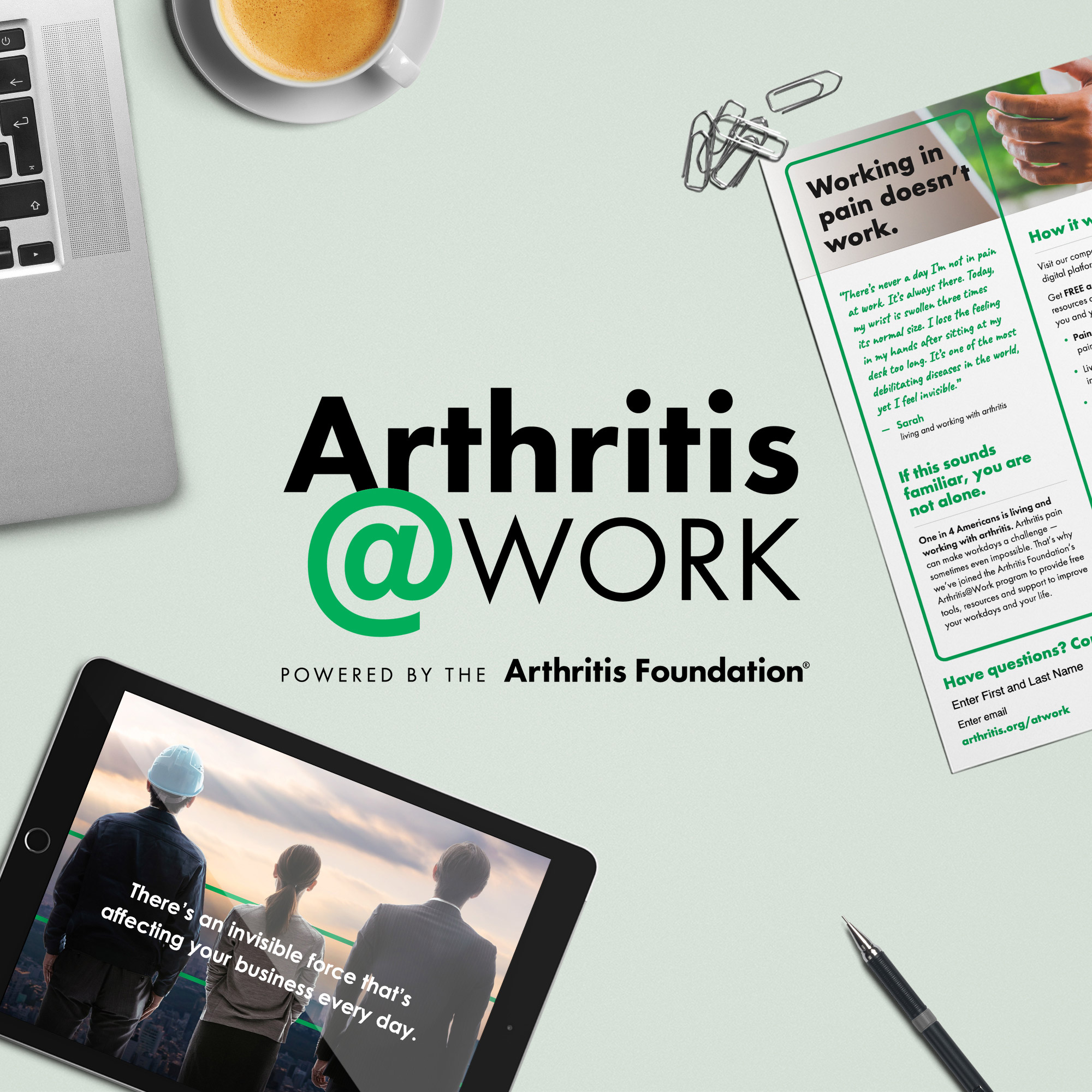
Conquering Arthritis in the Workplace
Although arthritis is the leading cause of disability in America, the Arthritis Foundation was struggling to get companies outside of the pharmaceutical industry to recognize its relevance and importance.
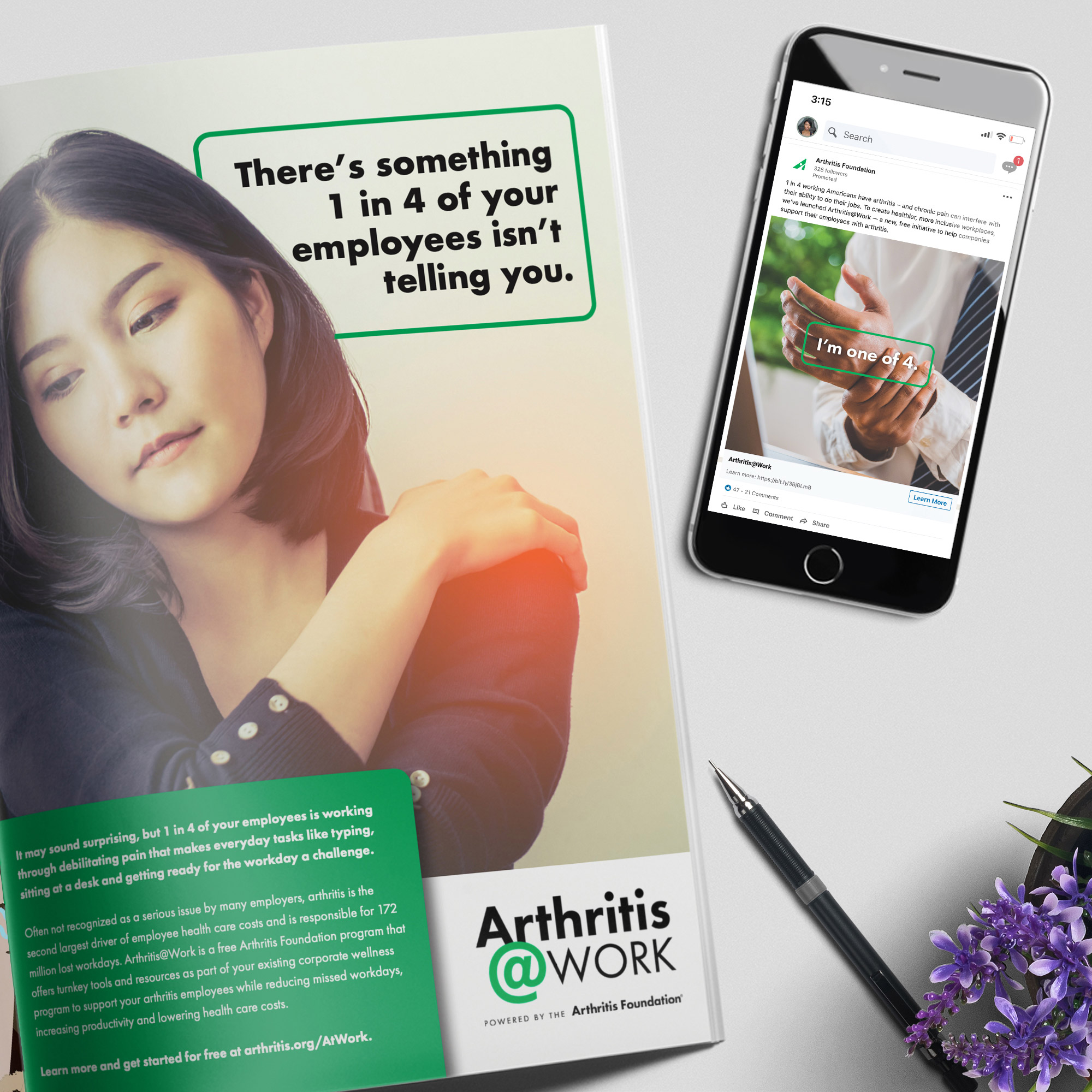
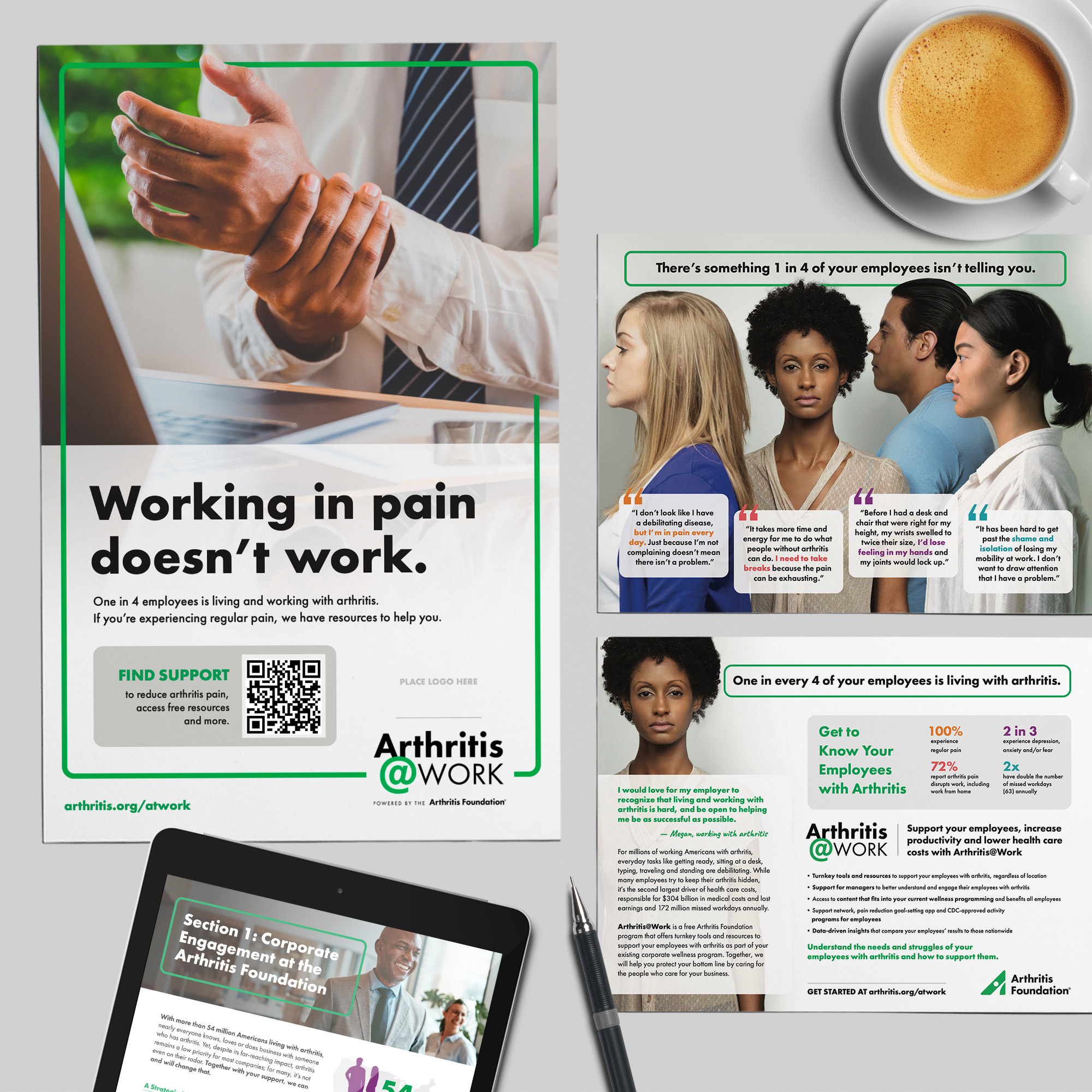
Qualitative interviews with business leaders revealed a lack of awareness that 1 in 4 employees are living and working with arthritis and its severe physical and mental health impact.
Knowing that corporate support is essential to conquer arthritis, the Arthritis Foundation hired Round Square to help tell and sell the arthritis story to engage more companies to support its mission.
Because most companies don’t see arthritis as the relevant and urgent issue it is, we needed to show corporate America how, if unaddressed, arthritis could impact their bottom line while adding value before asking for value.
Together with Arthritis Foundation staff, we created a new program called Arthritis@Work. This free program allows staff and volunteers to get a foot in the door with companies by offering turnkey tools and resources to support their employees as part of their existing corporate wellness program.
In addition to developing the name and logo for the program, we created a corporate sales deck, pitch materials, office promotional materials, staff engagement toolkits and more.
In just four months after launching the Arthritis@Work program, the Arthritis Foundation had signed on 35 companies, including brands like Aflac, FedEx, L’Oréal, Lowe’s, Panera and more. Today, nearly 100 partners are on board, with a goal to recruit 200 more in the year ahead.
Staff and volunteers responsible for identifying, securing and stewarding corporate partnerships have said this is the “best program they’ve had” at the Foundation, with one relationship manager saying the Arthritis@Work program has enabled her to finally get out of the lobby and into a meeting room with corporate decision-makers.
Round Square continues to provide communications and marketing strategy to support corporate engagement at the Arthritis Foundation.
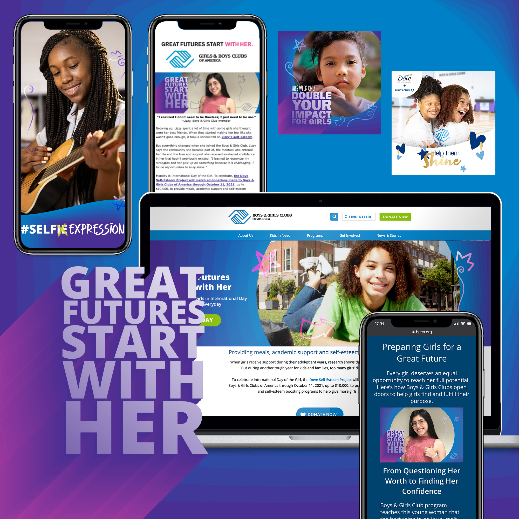
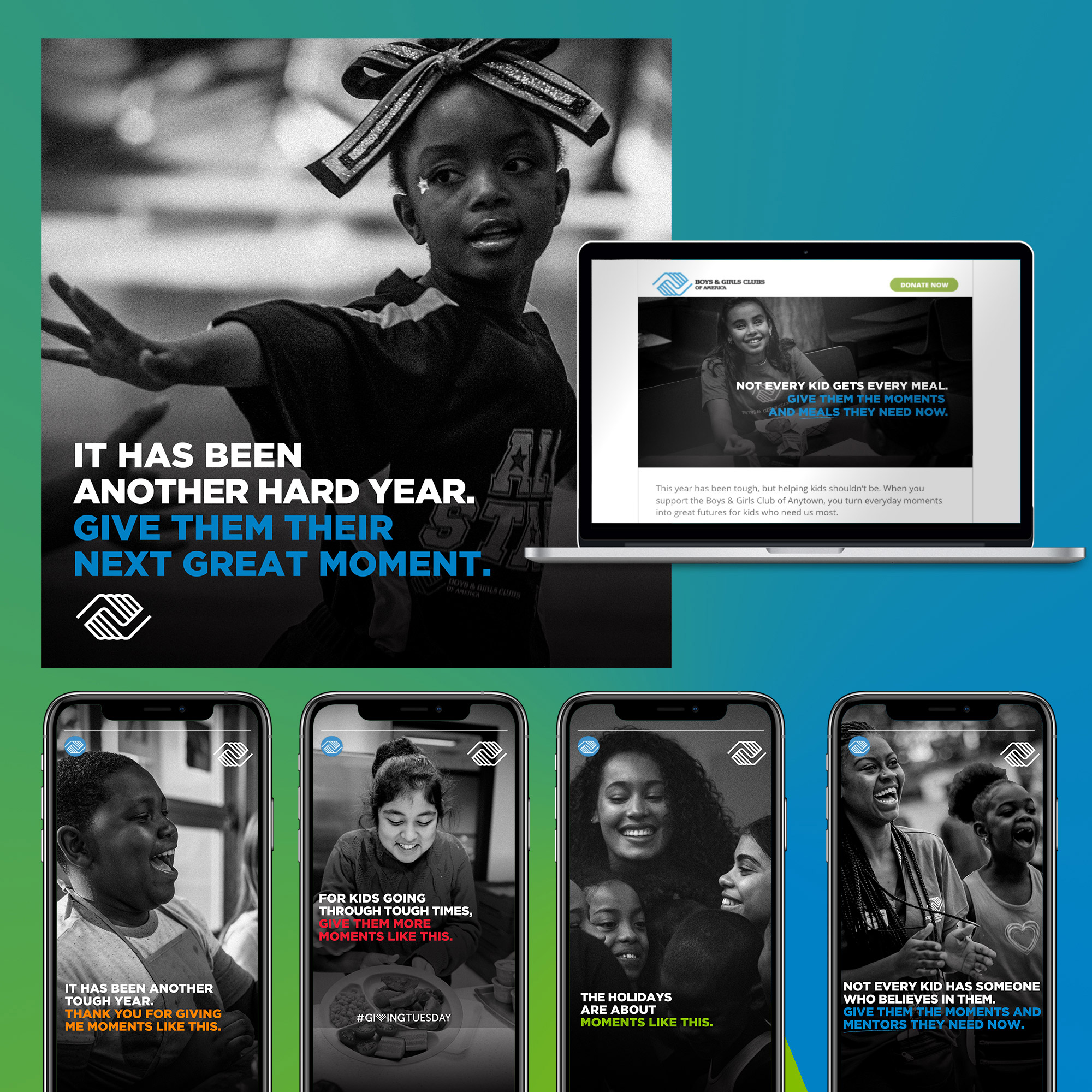
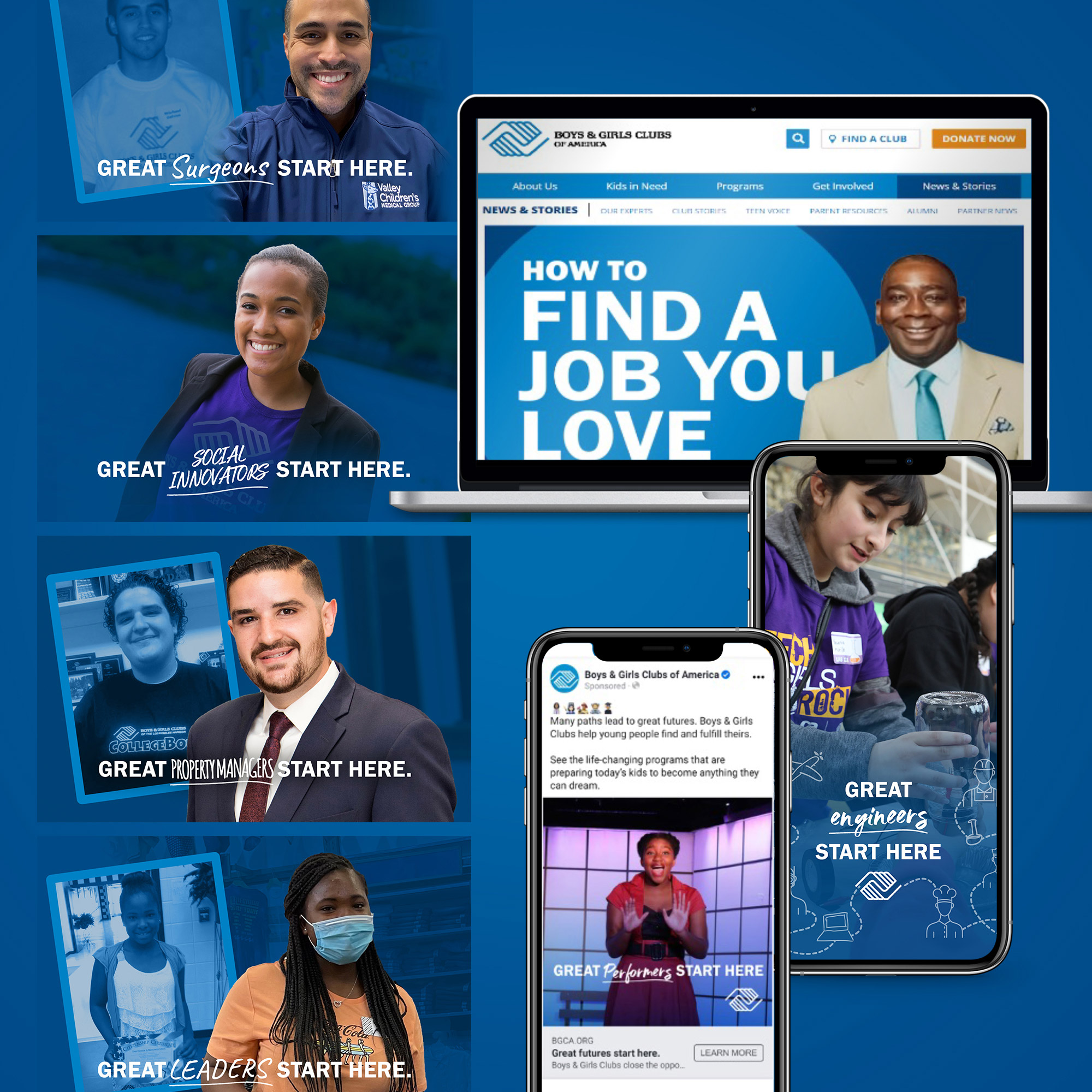
Making Great Futures Possible
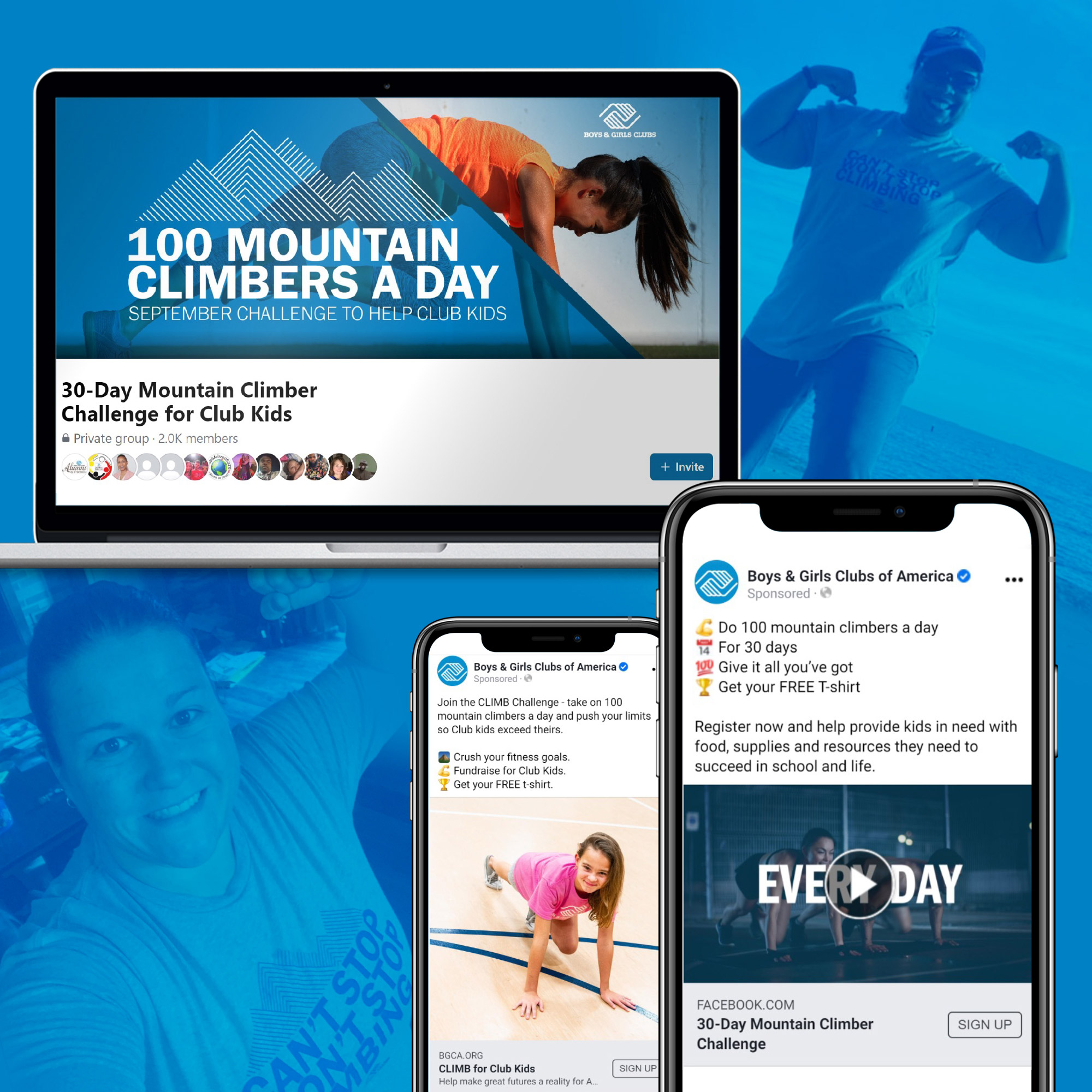
Boys & Girls Clubs of America needed help communicating its life-changing mission to inspire more people to support the organization. With an integrated direct marketing program in its infancy stages, an inactive email list and underperforming digital channels, Boys & Girls Clubs of America turned to Round Square and Streetlight Digital to optimize its program, grow online revenue and help make great futures possible for more kids who need us most.
Little did anyone know that after just one month of joining forces, COVID-19 would change everything. This forced many of the 4,000 Clubs across the country to temporarily close doors and find new ways to serve kids, families and communities. Round Square quickly created content and campaigns that elevated the human service elements that Clubs provide, including meals and basic necessities to survive, child care for essential workers, and devices and support to participate in virtual school. By treating donors and prospects as partners, we were able to cultivate supporters with high impact, timely and relevant stories that related to their own lives.
Meanwhile, our friends at Streetlight Digital began optimizing digital advertising, the Google Ad Grant, the website and more. The result was integrated, year-round storytelling and fundraising that blended data, technology and human emotions to drive meaningful action.
In our first year of working together, Round Square and Streetlight Digital ushered in transformational results:
- 114% increase in total online revenue, including an 86% increase in revenue during Q4 and a 71% increase in new donors
- 117% increase in pageviews to News & Stories, optimized to convert readers to sign up for email or donate
- A positive return on ad spend every month since assuming oversight
The team has described our work as transformational, helping the organization “become more relevant” to prospects and donors, with “an incredible response nationwide.” Round Square continues to support Boys & Girls Clubs of America on a variety of campaigns and projects.
Strengthening Nonprofits & Communities
The Nonprofit Leadership Center (NLC) is a unique nonprofit that supports the growth and impact of other nonprofits by providing dozens of professional development classes, a conference, small-group learning cohorts and custom solutions each year.
NLC turned to Round Square to elevate its communications to the same level of excellence as its services. The organization needed full-service communications and marketing support to better connect with its audience, grow its community, increase event participation, and position the organization as a leader in the nonprofit sector.
After conducting qualitative interviews and extensive research, Round Square developed and implemented a strategic marketing communications plan that includes:
- A year-round content calendar to drive and guide all communications
- Strategic blog content based on keyword research and audience insights
- Revamped email strategy, creative and messaging
- Social media strategy
- Google Ad Grant management and expansion
- Digital advertising
- Staff, trainer and board engagement
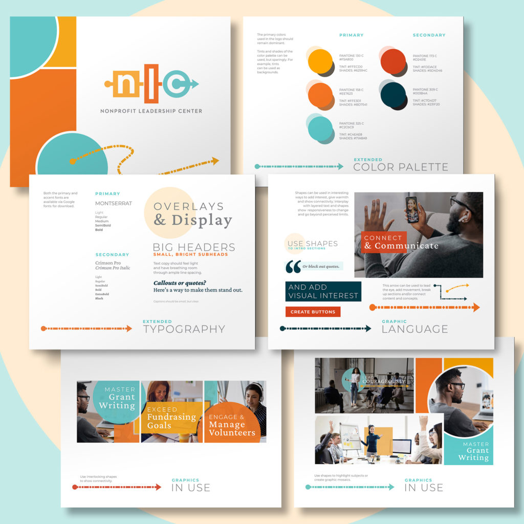
- Brand identity visual refresh
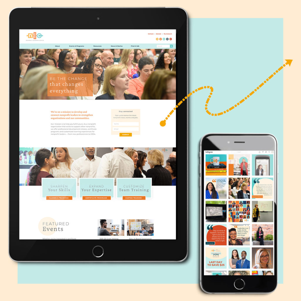
- Website refresh
- Ongoing thought leadership
- Impact strategy and measurement
With Round Square as its long-time communications partner, NLC has seen transformational growth during the past five years:
- 205% increase in monthly website visits
- More than 50% of event registrations now come from communications channels managed by Round Square
- 102% increase in class size
- 48% increase in total event participants and a 50% increase in participating organizations
- Largest annual conference and graduate certificate program in organization’s history
- Highest revenue year in NLC’s 20+-year history
- 1,375% increase in NLC’s LinkedIn community, with more than 50,000 followers to date
Round Square continues to provide strategic communications and day-to-day marketing communications support to drive NLC’s business objectives and continued growth.
Inspiring the Next Generation of Students
After several challenging years of teaching through the pandemic and with intense competition in their market, Nativity Catholic School’s student recruitment and retention numbers had fallen. Just ahead of its 60th anniversary, the school recognized it needed to assess and revitalize its brand to successfully recruit and retain more students. Thanks to generous funding from a local foundation, they turned to Round Square to review and refresh their brand.
We uncovered that what differentiates the school is its warm and welcoming community, yet Nativity’s brand was visually cold, with just a single dark blue color, very few photos of its students, and empty boxes in its logo that left audiences unsure what it stood for. Additionally, messaging elevated its faith-based foundation over its curriculum, leading families to question the quality of its academics.
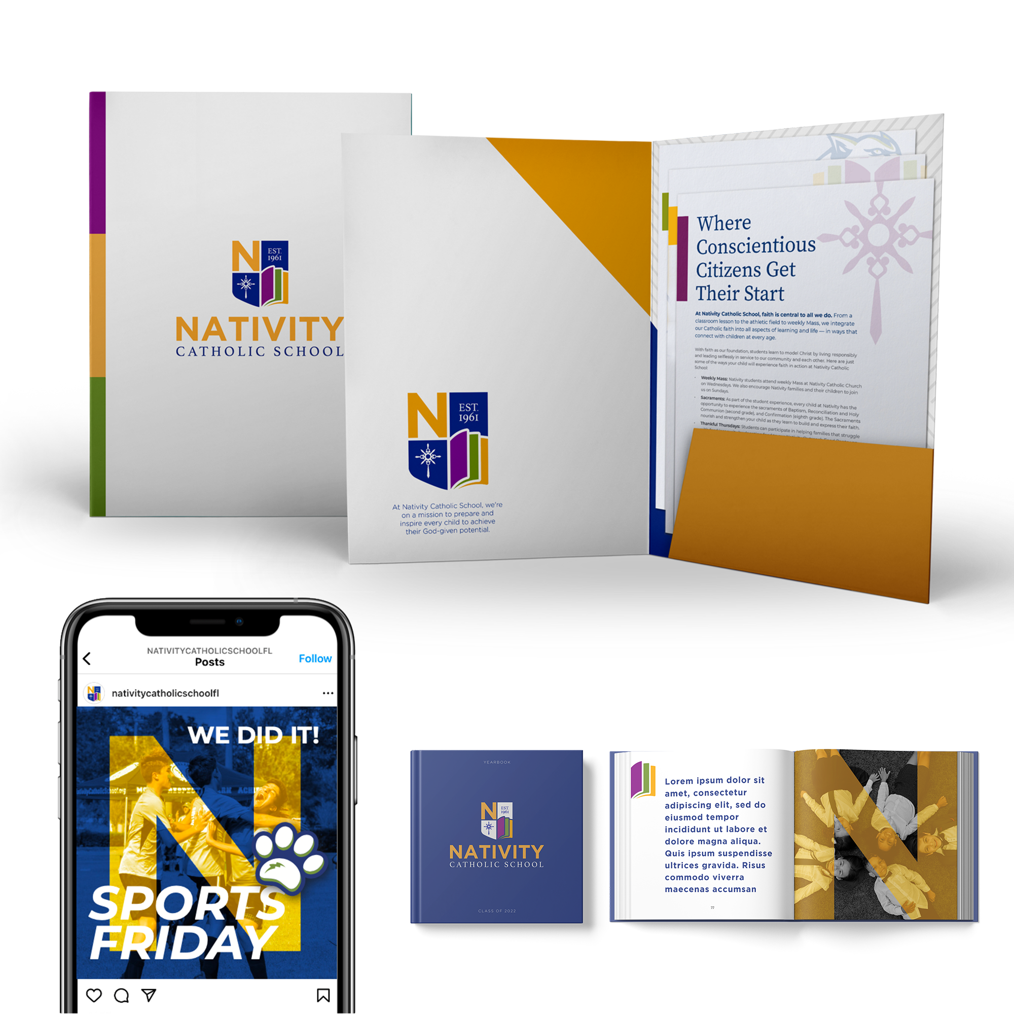
Armed with research insights from more than 115 stakeholders, Round Square revitalized the Nativity Catholic School brand, including a new brand strategy, logo and visual identity to prepare the organization for its next 60 years.
Both new positioning and visuals now reflect the school’s warm and welcoming community, shifting from a jargon-heavy, visually static brand to lay-friendly language and a vibrant color palette reflective of its close-knit community.
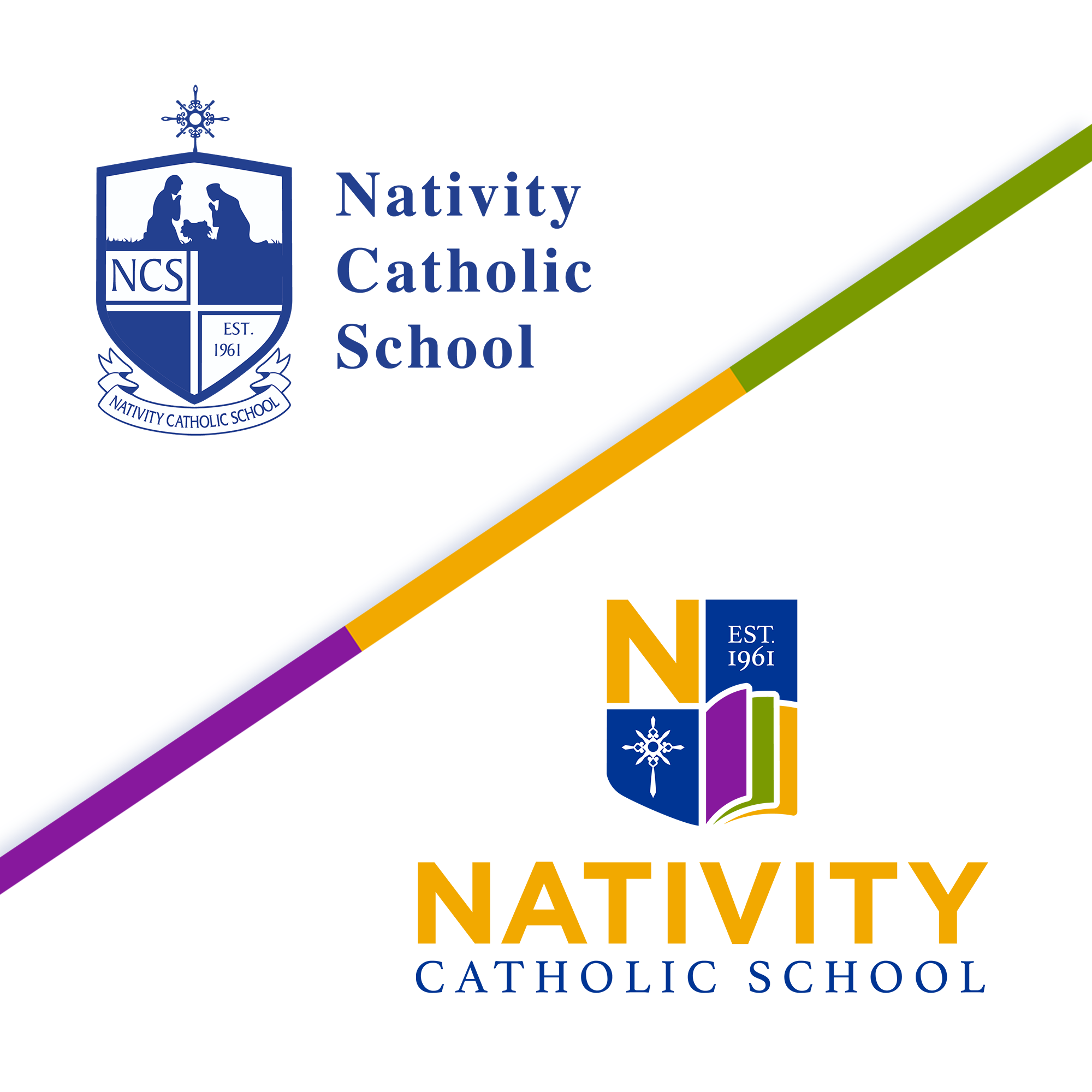
The new logo maintains its original shield outline to demonstrate longevity while evolving it into a dynamic, unsymmetrical shape that reflects the diversity of its students and their many potential paths to success.
Each part of the shield now reflects the school’s three priority mission areas: 1) the cross represents its Catholic roots and is the same cross that sits atop the highest part of its campus, 2) the open book leverages the symbolism of threes while conveying academics and the opportunities Nativity opens for students, and 3) the “N” from the Nativity typeface showcases the athletic and extracurricular aspects of student life, with the “N” now the primary symbol of the athletic program alongside a new cougar.
The revitalized brand strategy and identity were met with great excitement by teachers, faculty and families. Nativity’s principal reported that the refreshed branding has directly impacted increased enrollment in the two years immediately following the launch.
“We are beyond happy with the results of our work with Round Square. We can now consistently articulate our purpose, and our stakeholders find our communications clear, clean and relevant. The work we accomplished with Round Square has provided us with the tools, resources and understanding of what needs to be done to obtain the impact we want to make on our community.”

Making Today Better & the Future Brighter for Families
Phelan-McDermid syndrome is a rare genetic disorder that compromises many critical functions in a person’s body — from learning and communicating to eating and sleeping. Children with this complex medical condition are born with a genetic difference on their 22nd chromosome that causes intellectual and physical disabilities that require long-term care and medical attention. Currently, there are no treatments or cures.
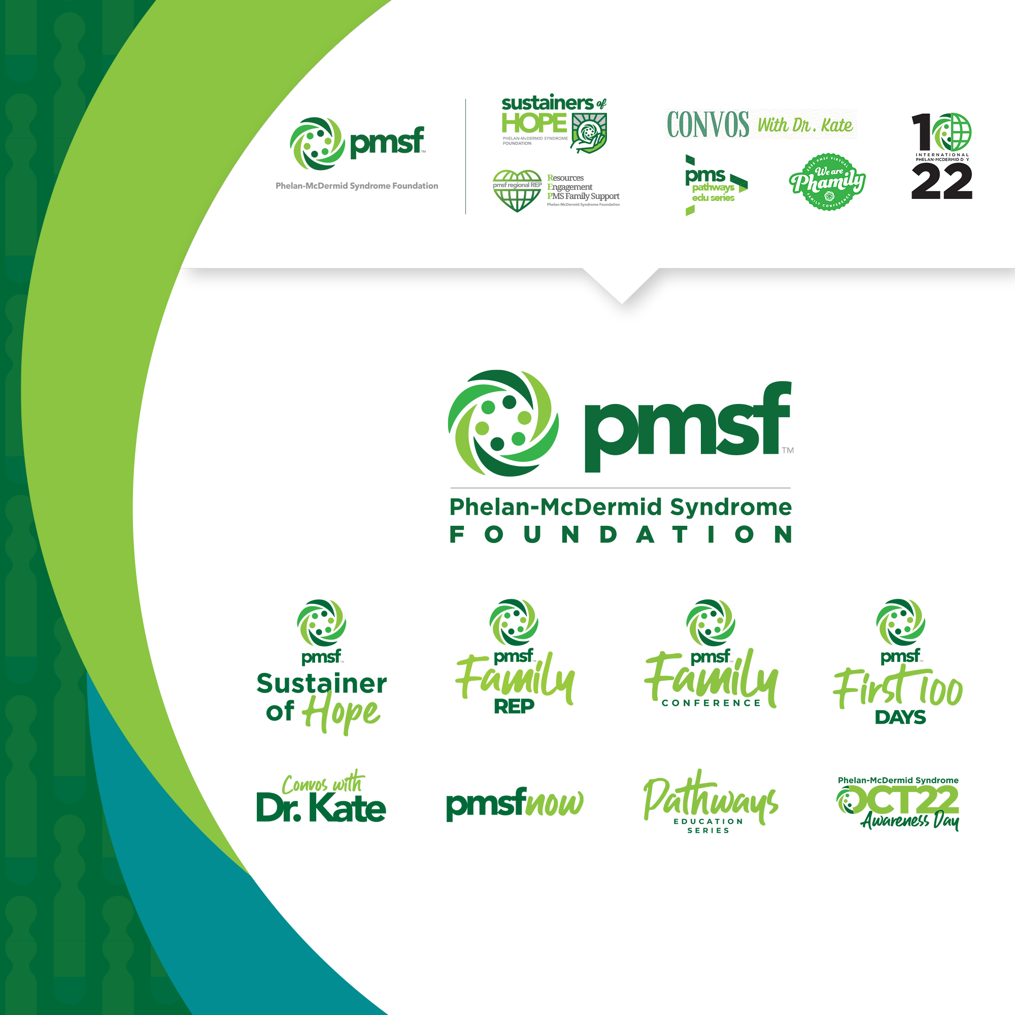
Because most people, including medical professionals, have never heard of Phelan-McDermid syndrome and because it is difficult to explain, the Phelan-McDermid Syndrome Foundation hired Round Square to help clarify its brand identity and messaging to drive increased awareness and fundraising.
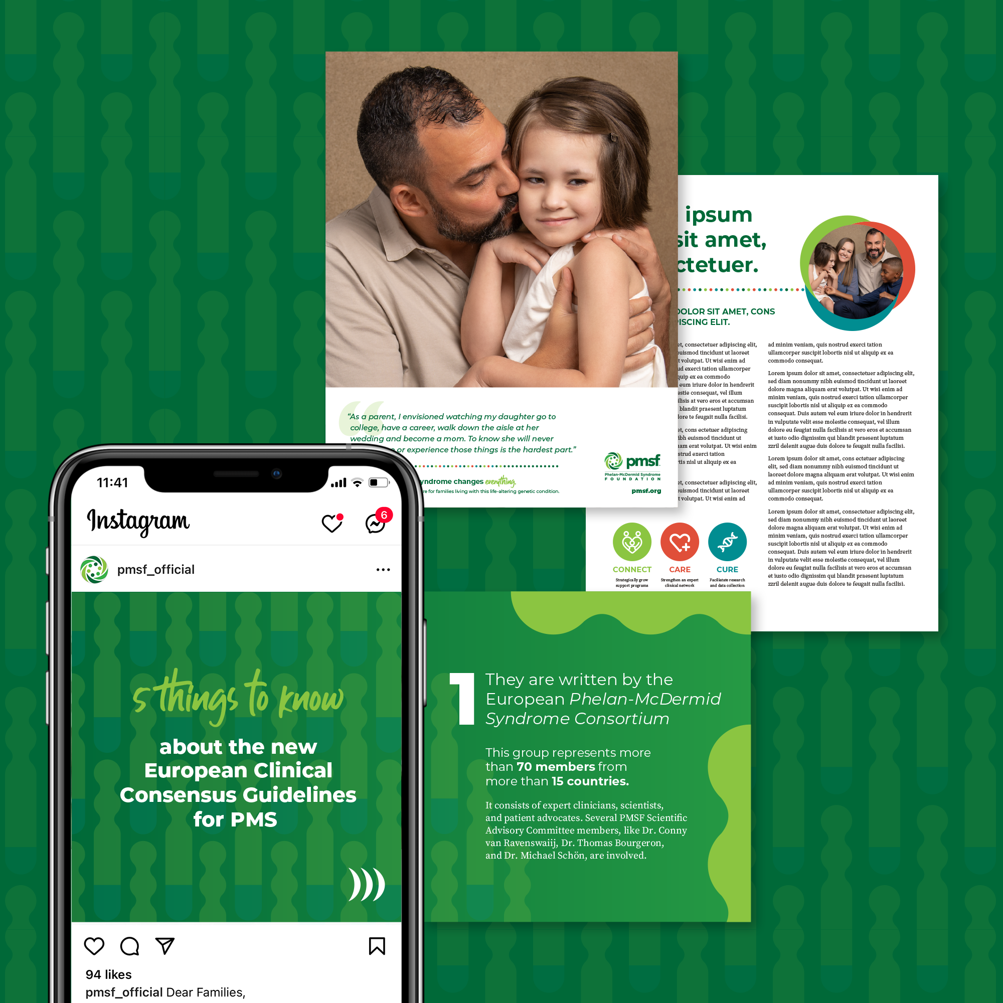
Extensive research revealed that clarifying the Foundation’s brand required better defining and “branding” the syndrome itself, elevating its important role in advancing research, and visually portraying its warm, family-like approach.
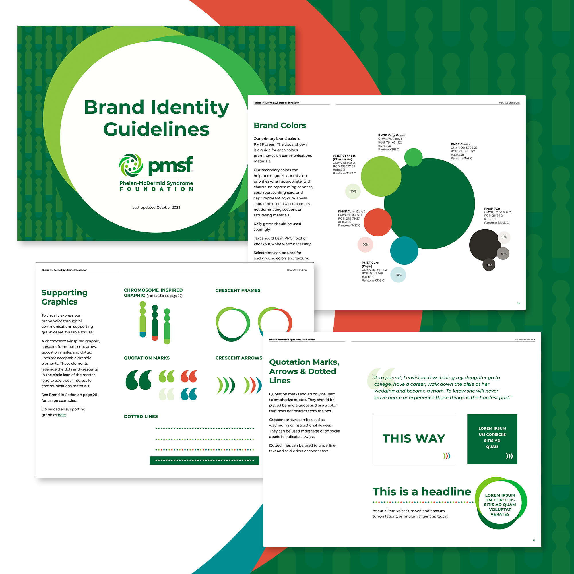
Round Square developed a new brand strategy for the Foundation, including how to better explain what Phelan-McDermid syndrome is in lay-friendly, emotionally connective language. We also created new brand identity guidelines that transformed a fragmented family of sub-brands into a seamless creative system, introducing new, warmer secondary colors and extending the crescents and dots from the Foundation’s existing logo as graphic assets, including photo frames, way-finding devices and dotted lines. This included a new graphic inspired by the genetic difference on chromosome 22 to create background patterns that visually highlight its research leadership.
The Phelan-McDermid Syndrome Foundation has just begun to implement the new brand strategy and identity and has hired a communications director to bring it to life across all its channels. The leadership team described Round Square’s work as “transformative for the organization.”
“Round Square is the most outstanding and productive consultant I’ve had the honor of engaging in more than 40 years of work.” Ronni Blumenthal, CEO, Phelan-McDermid Syndrome
Hope for Women Experiencing Crisis & Trauma
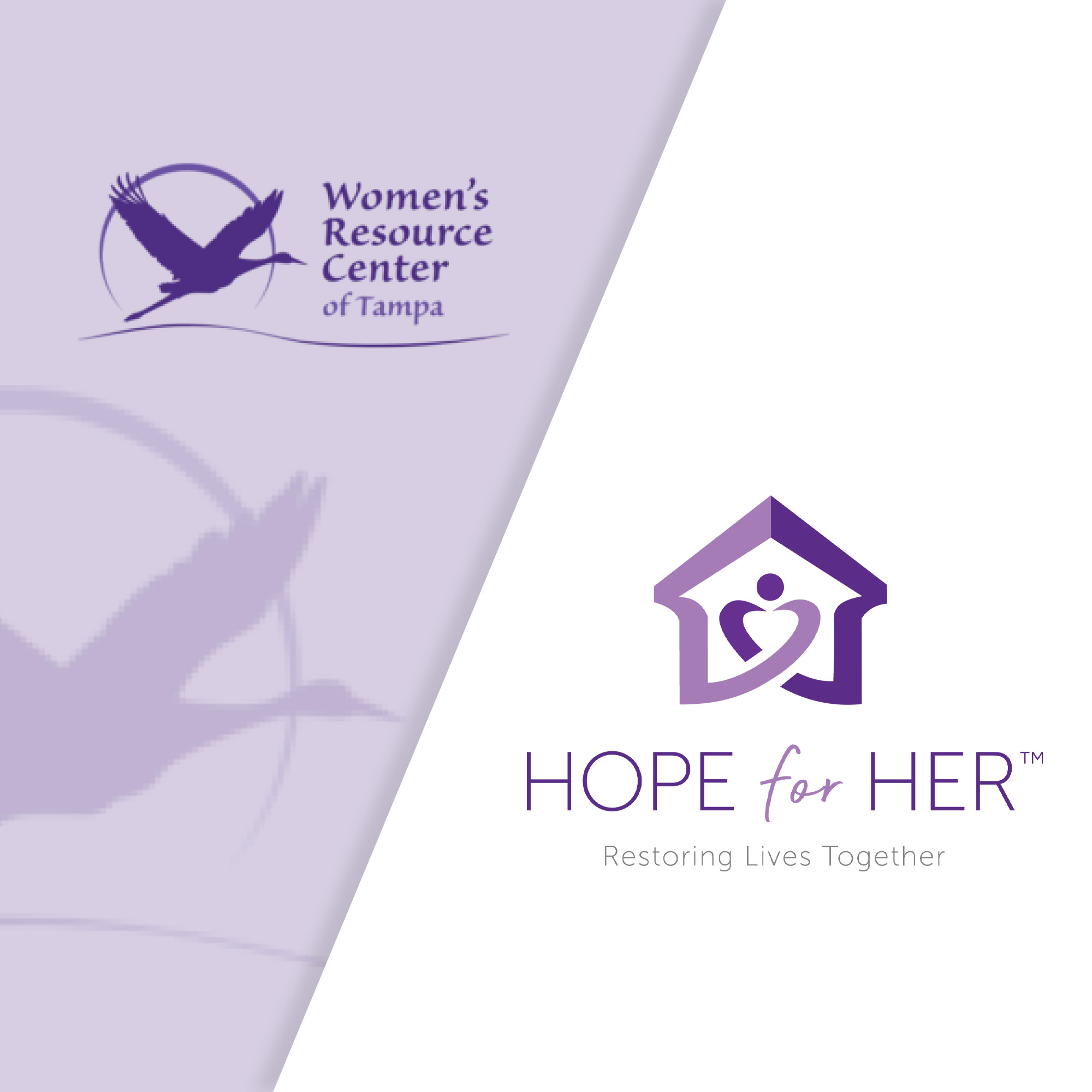
The Women’s Resource Center (a name shared by hundreds of organizations) was in a tiny space, forced to turn away hundreds of women who needed them due to space, capacity and resource constraints. They needed to refresh and clarify their identity if they wanted to raise the necessary funds to reach more women and children. They turned to Round Square for help.
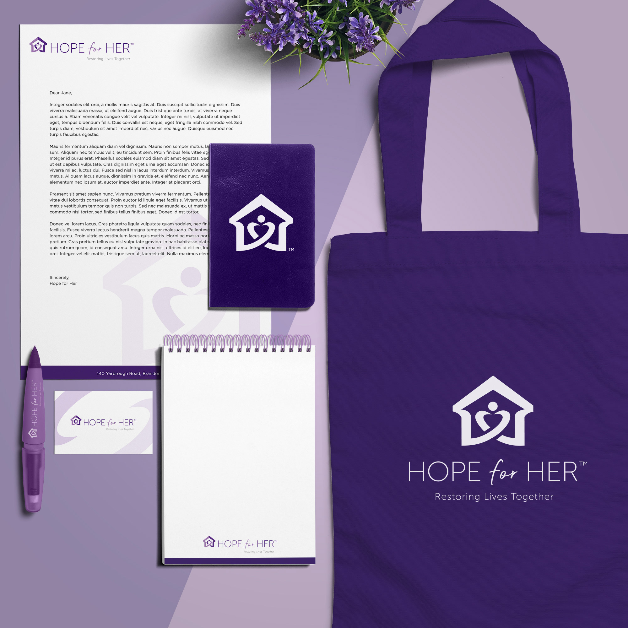
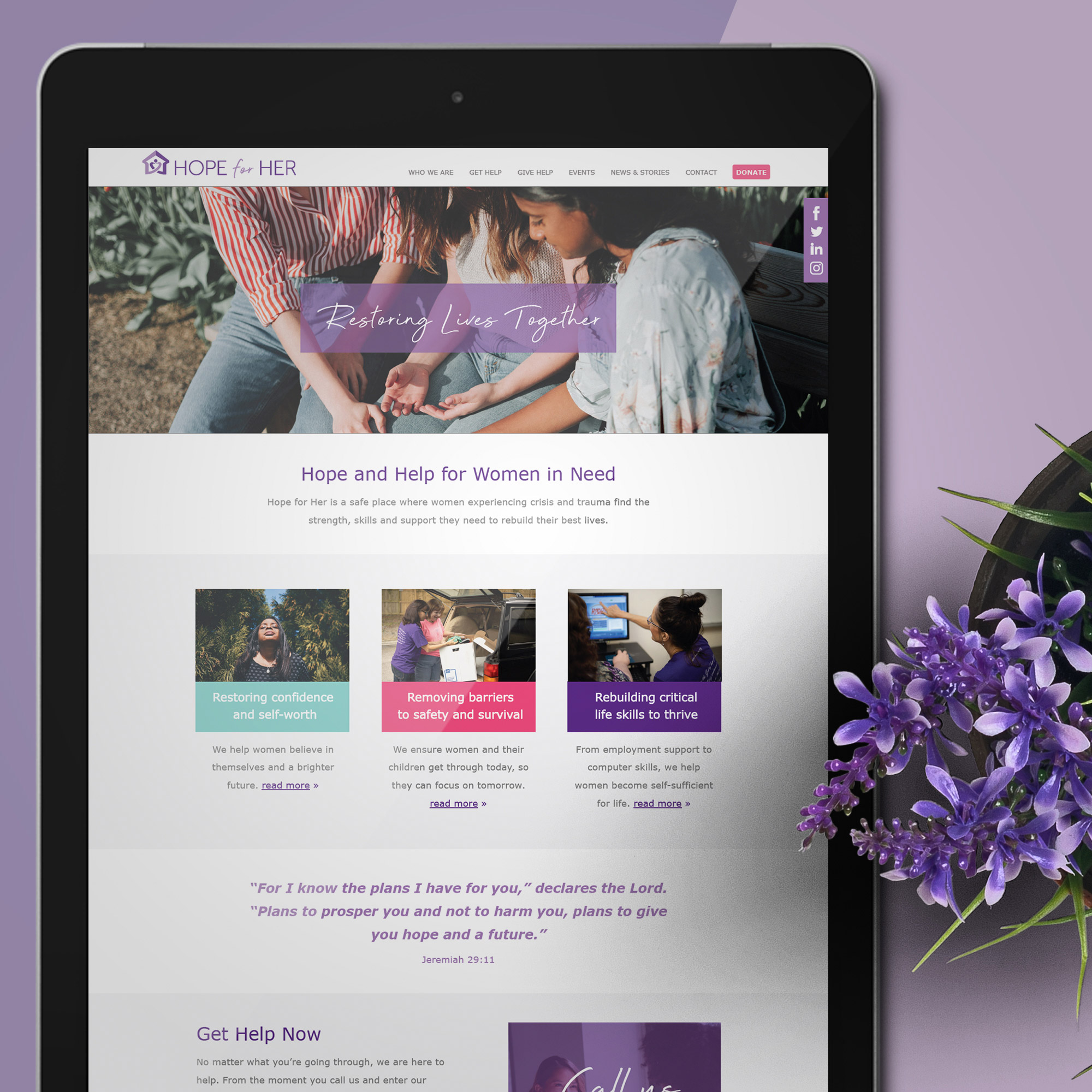
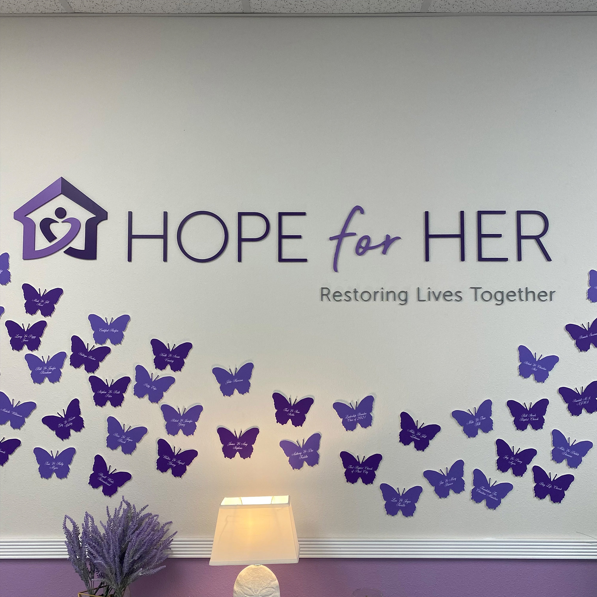
After conducting extensive qualitative research and assessing the marketplace opportunities, Round Square revitalized the Women’s Resource Center brand, including a new name, logo and identity, brand strategy, and messaging.
- The new name, Hope for Her, now literally conveys what they do.
- The house and woman inside the logo suggest they provide a safe place for women experiencing crisis and trauma. The lines reflect a warm embrace that portrays their loving and compassionate approach where guests are never a number, but the lines never close, indicating that every woman can break free from her current circumstances.
- The house is also an arrow pointing upward, indicating both their belief in what’s possible and their faith-based foundation.
- The changing colors of the icon from light to dark purple reflect the transformation that happens for guests.
- The letters forming the words “Hope” and “Her” are uppercase to symbolize strength and grounding but use a delicate font to showcase femininity. The cursive “for” introduces a warm and personal feel.
Thanks in part to a revitalized brand that more clearly convey’s their mission and has compelled more supporters to donate, Hope for Her opened a new 10,000 square-foot facility in 2021 to provide a safe place for more women experiencing crisis and trauma to find the strength, skills and support they need to rebuild their best lives. Hope for Her anticipates being able to serve 400 more women per month.
